I spend a lot of time thinking about what “modern” actually means in visual terms, because it is one of those words clients use constantly and rarely mean the same thing twice. Sometimes it means minimal. Sometimes it means bold and current. Sometimes it just means “does not look like the site was built before smartphones existed.”
When I looked seriously at what uKit AI does to an outdated website, I was interested in which of those things it addresses. The short answer is: it reliably addresses the third one, partially addresses the first, and does not touch the second at all. Let me explain what I mean and why it matters depending on who is asking the question.
What the AI Is Working With
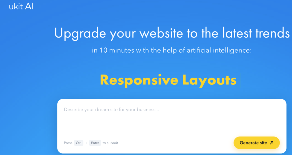
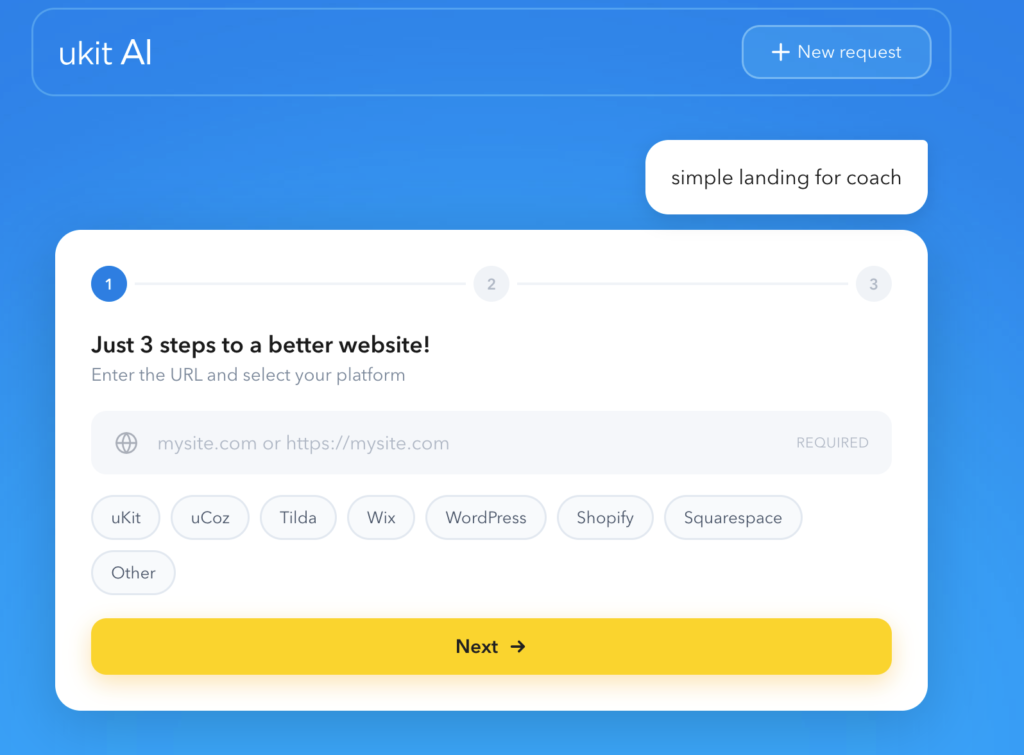
uKit AI takes a URL to an existing site. It analyzes the layout and content, then generates a modernized version. The content stays the same – same text, same service descriptions, same business information. What changes is how that content is presented: the layout structure, the responsive behavior, the spacing and type conventions, the underlying code.
From a graphic design perspective, this is operating on the surface layer – visual conventions and technical structure – not on the decisions that define a brand’s visual identity. That is a meaningful distinction, and it shapes everything about how the output should be evaluated.
What Gets Better, Visually
Spatial organization and breathing room. Older websites are dense. Elements crowd each other, sections run together, there is insufficient negative space for the eye to settle. This is partly a convention of the era in which they were built – web design in 2012 assumed that screen space was scarce and information should fill it. Current design conventions use space more deliberately, and AI-upgraded layouts reflect this shift. Things feel less cluttered without anything being removed.
Mobile behavior. This is where the visual improvement is most dramatic. A fixed-width desktop layout on a phone is not merely inconvenient – it communicates incompetence. Not intentionally, but unmistakably. The layout is broken, and broken layouts read as unattended. A mobile-responsive layout reads as intentional, even if nothing else about the design changed. The perceptual jump from “broken on mobile” to “adapts to mobile” is one of the most significant visual improvements available to an outdated site, and the AI addresses it automatically.
Type hierarchy. Modern layouts apply more consistent and readable hierarchy: the H1 is clearly differentiated from the H2, body text is sized for actual reading comfort rather than fitting a maximum amount of text into a fixed area, section breaks are visually meaningful rather than just spatial. Older sites often have inconsistent or collapsed hierarchy. The AI-generated version normalizes this, which produces a cleaner, more professional-looking reading experience.
Perceived competence. Before a visitor reads a single word, they have formed an impression based on visual cues. A mobile-responsive layout with consistent spacing and current conventions signals that someone has maintained this site recently. An outdated layout signals the opposite. This credibility signal is not nothing – it sets the context in which everything else on the page is read.
What Does Not Get Better
Visual identity. The AI applies current conventions. It does not make brand choices. The output is competent and current but not distinctive. If a business needs to communicate something specific – warmth, technical authority, creative originality, precision – that communication requires choices that conventions do not determine. The AI upgraded defaults; it did not express a brand.
Color system. The AI works from what is already there. If the original site had a dated or weak color palette, the upgraded version has the same palette in a better layout. Color is one of the strongest visual signals of a brand’s currency and personality, and it is also one of the things an automatic upgrade cannot improve without guessing – which it does not attempt to do.
Photography and visual assets. No visual asset quality improvement happens in the upgrade. Stock photos from eight years ago stay as they are. Outdated or low-resolution images in a modern layout are often more visible as a problem, not less – because the contrast between the contemporary frame and the dated content inside it is starker. An upgrade that is not accompanied by an asset review can inadvertently make the photography look worse in relative terms.
Distinctiveness. The platform choice matters here too. For creative businesses specifically, the question is not just whether the site looks current but whether it communicates something true and specific about the work. For context on how different platforms handle the expressive range available to creative businesses, the comparison in Wix vs uKit is worth reading before deciding whether an AI upgrade on a given platform is the right long-term home for a creative portfolio or studio site.
The “Competent but Anonymous” Problem
The most consistent limitation in AI-upgraded sites is what I would call the competent-but-anonymous result. The layout looks like a modern website. It looks like a lot of modern websites. The conventions are correctly applied. The visual language is generic.
For businesses where “not embarrassing on a phone” is the realistic goal – a local service company, a small practice that relies mainly on referrals, a business where the website is not a primary sales tool – this is a perfectly fine outcome. The upgrade removes the technical problems, and the content does the rest.
For creative businesses, studios, or anyone whose visual identity is part of the offer – including any design or branding studio – the competent-but-anonymous outcome is a real limitation. A design studio whose own website looks like a default template is communicating something about its work, and it is not the right thing.
The Useful Scenarios
An AI upgrade is genuinely useful in the right situations:
When the site is technically embarrassing and the business knows it. A layout that breaks on mobile and runs on HTTP actively costs the business credibility. Fixing that quickly with an AI tool is a practical, proportionate response.
As a fast baseline before a real redesign. An AI-generated version of a client’s current site is a useful artifact to react to – it makes the gaps in visual identity, content quality, and brand differentiation concrete rather than abstract. “The AI made it look modern but it still does not feel like us” is a more productive brief than a blank conversation about brand direction.
As a platform for adding interactive tools without the visual design effort. A faster, responsive site is a better environment for adding utility – a pricing calculator, a quote request form, a project estimator. If you are evaluating which calculator tool to add to a site that has just gone through a visual refresh, Similarly, before choosing any data collection tool for client research or visitor feedback – which often gets added alongside a site refresh – the comparison in SurveyNinja vs Typeform is a good starting point for understanding how the tools differ structurally, not just in price.
The Designer’s Honest Take
Yes, uKit AI makes an old website feel less dated. The mobile responsiveness, the improved spatial organization, the normalized type hierarchy – these are real and visible improvements that a non-technical business owner cannot easily achieve any other way.
But less dated and genuinely modern are not exactly the same thing. A site that follows current conventions looks competent. A site designed with intention for this brand, this audience, and this moment looks specific. The AI handles the first one reliably. The second one requires someone who can see the difference and make choices accordingly – which is the work a graphic designer or visual brand specialist does that no automated tool currently replaces.
For businesses and clients evaluating this kind of tool: the upgrade is real. What follows the upgrade, in terms of visual identity, content quality, and intentional brand expression, is where the actual design work begins.
Read also: Which Calculator Builder Should You Choose?